Volume Ticker Comparison
Below is the transcript of the video you’ll get access to with your subscription.
Hello everyone. This is Ralph. And today I am going to show you how to use the volume ticker comparison study in your everyday trading. So let’s get started. We’re currently looking at a chart that is plotting a new bar, every 30 minutes of the e-mini S&P futures. I also have a study that’s highlighting the opening candle for each session, so that it’s easier to see.
Let’s add the volume ticker comparison study. Now make sure you add the right study because there’s the volume comparison study in the volume ticker comparison study. Make sure you select the latter click on add then open up settings. We’ll leave everything as the defaults we’ll hit. Apply. Okay. And now we can see the study being plotted in a new sub graph under the graph.
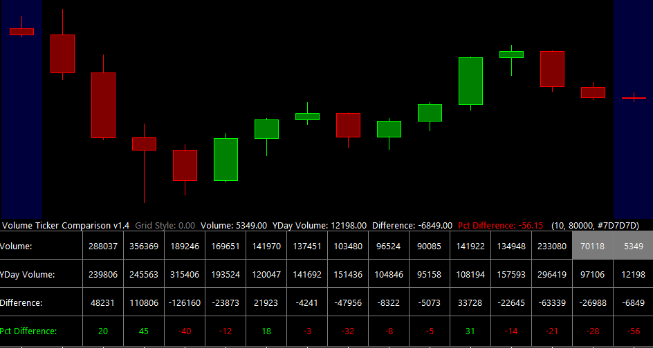
The way that I like to use this study is mainly when price is trending up. And I think yesterday we had a good example. If I scroll over to the right, which I’ll show you in just a moment, you’ll notice what I mean by it. So this was the opening candle for the regular training session on Thursday. As you can see at one point in time, we cleared the high and then we traded up.
But the study told me that the volume behind this move wasn’t that strong. I know that the volume wasn’t strong because I’ve actually calculated the average volume per candle on a 30 minute chart over the last eight years. And I know that that volume is 8,000 in. I know that I should expect to see more than 8,000 contracts traded per candle for me to consider this move as a strong, directional move.
So knowing that information, what do you think that happened today on Friday? Well, let’s scroll over.
And I’m not sure why the background is in painting here. This is from a Sierra chart study, but this is the opening candle. As you can see overnight, we tread down and then during the session, we again triggered him further down, which is backed by this data. Let’s see if we can find another example of this.
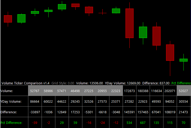
This is another great example. So you only want to use this study. Whenever price has been trending either up or down. So if price has been in a range, you don’t really want to be looking at this study. For example, a range would be from this high. To this low and you see all these candles going back and forth, going back and forth right here.
We try to break from the range, but then we really just got back into it. Only once we started really breaking the highs, did we really get into a trend? And this is another example back here of the same thing. We go from trend to range. To another trend. And that’s what you want to be looking for is when we’re trending, you want to be observing the volume.
Okay. So looking at the session we traded up during the last four 30 minute candles of the day, that move was substantiated by the number of contracts that were trading during those periods. And we can see that price then continued up.
And look, it kept going higher. This is something that I’ve seen play out many times throughout my traiding career. And it’s something that I can lean on whenever I place a trade. So I hope you found this video useful and you can incorporate this study into your everyday trading until next time everyone, Happy Trading.

