Below is the transcript of the video you’ll get access to with your subscription.
Hello folks, this is Ralph. And today I’m going to show you how to set up the ended auction study in Sierra Chart. So let’s go ahead and add it to our chart first. And then we’ll talk about the settings. Under add custom study. You’ll find the ended auction study. Let’s click on add, and again, let’s just click on apply.
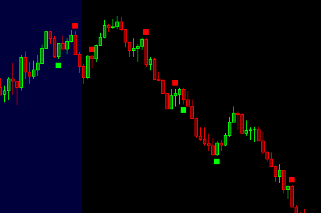
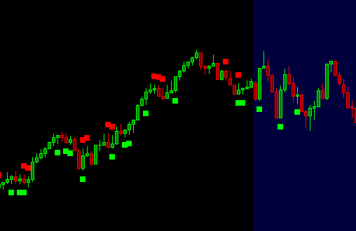
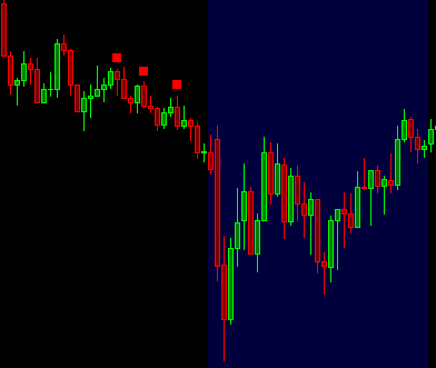
We’ll talk about some of the basics here, and then we’ll go over to the settings. So you can see some of these little squares that get added in at different points throughout the chart. And I’m just going to talk about the mechanics here first. So if we look at. Yeah, this little square over here, this red one there’s information in that candle.
In fact, in all the candles that keeps track of all the orders that were placed at the bid and ask that were traded at each price level. So if we’re looking at our price scale over here, and I’m just going to draw a little. Bar over here, please don’t judge my drawing, but at each price level. So we have all these different levels and I’m just gonna make it spacious here.
But imagine, you know, let’s just pick 50 and 48. So we have level 50 right here and I’ll draw 48 right here. So, and again, it’s just 3350, 3348. So at each price level there’s information that is tracked. And there’s essentially these two columns in each bar. Right. And it keeps track of all of the contracts that were traded in the bid and in the ask.
All right. And the way that it works is if we look at this candle again, this green one right here, the red one, right before it closed right at the low right here. So then the next candle is green candle opened up right next to it. And then it closed up here. Right. Just pretty simple stuff. But throughout this, you know, if we’re looking at now, they expanded candle right here.
Imagine the candle opened up right here and then we treated up. Right. So, you know, buyers and sellers traded different contracts as price was trading up. And hypothetically, when he got to the very top. There were only two buyers. And I have no idea because I can’t see this information in this type of chart, but the study can, and then because buyers and sellers need to cross the book.
Now imagine that there were 10 sellers at the very top. And the reason why it’s a diagonal is because, you know, we have bids. This may be getting a little messy here, but we have bids and we have asks right in the order book. So we have all these sellers that are passively, just waiting for price to reach them.
And then we have all these buyers doing the same thing, all these different price Lopes, but then you have the aggressive buyers and sellers, and then they essentially need a cross. If you’re a buyer, you need to cross the book. Right. So you’re crossing the book and you’re taking the liquidity from the seller and then the seller needs to do the same thing and aggressive seller needs to cross the book and then hit the bid and take the liquidity from those buyers sitting there.
And then whenever all the liquidity is taken, that’s when price ends up ticking down. So that’s essentially how it works. And you know, it may be redundant to some people, but. Traders who are aggressive, have to cross the book. So as price traded up on this candle that we’re talking about, hypothetically to buyers cross the book or one buyer traded two contracts on the buy side.
So this is all of the buyers that cross the book. And this is all of the sellers. So then at the same time or shortly thereafter, there was one or many other traders who traded a total of 10 contracts on the price below it. So to a price 33 50 and then 10 a price 33 48. So then this ratio of 10 to two turns out to be a five to one ratio.
And this is the important piece. There’s an imbalance of five to one or ratio of five to one. And when that ratio is large enough, you can lean on that and you can see that there’s many more buyers or sellers in this case that are willing to sell at this price. And then there’s less buyers. There’s less interest to continue buying the market.
And as you can see right here, the market just didn’t continue to move up market and said traded down. And it, of course, doesn’t always turn out this way, but you know, you can see it multiple times where there’s more buyers market in this case, traded up market in this case, traded down in the NEP and then same here traded up.
And trade it a little bit further up after trading down. So that’s essentially how it works. And hopefully that gives you, you know, an understanding of what the study is, looking at the studies, essentially looking at the tops and bottoms of each candle. So then in the other case, you know, for, for the bottom of it you’d have 10 or you saw her you’d have two to 10.
So the ratio at the bottom would be five to one. So then hypothetically, we could be talking about this little green square right here. All right. So I’m going to remove all these drawings because they’re getting a little messy, but the idea is simple. There’s imbalances at the top and at the bottom of each candle.
And when those imbalances meet certain conditions that the study is looking for, that’s when it’ll plot these little squares. All right. So now let’s go ahead and talk about the settings. All right. So now, if we look at the settings here, Oh, this first input is going to be that ratio that we’ve been talking about.
Know, you can change this to be six to one or whatever you’d like, but the point is that you can change it. And it’ll look for those imbalances at the very top of each candle on the bottom of each candle. Alright. So then the next input is essentially a condition for that imbalance side. So if we’re looking at that for.
Two one, what is the minimum number of contracts that need to be traded on the imbalanced side? And really the default for this should be four, because it can’t be anything lower than this imbalanced, multiple logically. But of course it really doesn’t matter if it’s lower. It’ll just. Pass, it’s essentially just a pass through, but you could make this minimum imbalance if you’re looking for only larger imbalances and you can configure this study in an interesting way.
Why, so you could do say a hundred is the minimum. And because there’s minimum side is a hundred, now the maximum number on the other side is going to be a quarter of that. Right? So it’s going to be 25. So it’ll be 25 or less. All right. So hopefully that makes sense. Now the third input allows us to override that second input.
So hopefully, you know, not making things too confusing, but it’s possible that the imbalance is 15 to one. All right now, you know, we have this imbalance of 15 to one, which is already, it’s pretty large. I mean, usually you can think of these numbers as multiples. So say you could multiply 15 by a hundreds and I have 1500 and then you have, on the other side, you’d have a hundred or 50 so that you can think of these like really large numbers that you’d want to target.
But if we bring this down to something that we can comprehend and talk easily right now, if we have, you know, the second inputs being a minimum of 20, but the override can be 15. So this is a ratio of 15 to one, allowing us to skip this because this is such a large imbalance. That we want to actually have a look at.
Alright. So hopefully that explains that third inputs, and again, they go in tandem with each other. The next input actually adds some pretty nice logic to the study. So again, if we have ratio of four to one on, on a candle yeah. One price level. Right. So if we have our candle right here, but then right under it, we have a ratio of.
Four to one. So this is one price level. This is another price level. And then this is a third price level. These four contracts on the bid are at the same price level as these four contracts on the ask. Okay. So what this study will do, is it a look for imbalances on the other side? So there’s an imbalance right here.
That matches the imbalanced multiple, even though we already have an imbalance similar to the one that we’ve been talking about over and over, why we would want to skip this type of imbalance, this four to one at the very top and not plot. This little red square is because there’s a lot of buyers still in the market.
Okay. I, no, I’m making it a little bit blurry in here, but there’s four to one at two consecutive price levels and they’ll actually look through a lot more price levels. So it has a lot of really intense logic in the algorithm, but you know, you can think of it simply it’s just back to back levels and there’s two imbalances on both sides.
The algorithm just decides to skip it if you have this set to yes. All right. So hopefully that explains that input. And then this next input requires these little squares to have a proceeding square. And right now we can’t see them, but you know what? We’re going to change this to. No. And then you’re going to see squares that begin to plot before these other ones.
Okay, so I’ll apply this and now you can see, you know, another green one got added here, a red one, this one we can’t see, but it’s possible that, that it’s getting hidden by one of the other settings. Even though this, this one that we see right here is actually looking at some other one that is, I don’t know, somewhere around here.
So that’s essentially what is required. And this is helpful because it allows us to know with confidence that there was previously other imbalances, even though we can’t visually see them. And that’s why you end up seeing a lot less of these little squares. All right. So that is what that input does.
We’ll flip this back on and then this next input will actually add a lot more squares. So we’ll go ahead and add it first and what it does, it essentially tries to look if you have it turned on. For tops and bottoms, like double tops and double bottoms. So you can see a lot of the, the ones that were plotted before were at double bottom.
So you have back to back candles that are, the lows are pretty close. If not exactly the same, same thing right here. And you know, this one also has the same thing as well as this one right here. So you can do this, but you can also change. How many takes away. You want these double bottoms to have from the, you know, like a little buffer.
So you could say four, and now you’re going to get a lot more plots. Or if you just simply turn this off, then that setting will not be considered. All right. So hopefully that helps out a little bit. The last input allows us to move these little squares away from the top and bottom of the candle so that you get a little bit more space, so you can do.
Uh, let’s do a higher number like eight. Okay. So now you get a lot more space or you can bring them down and make them a little tighter. Just depends on what type of chart your have and how zoomed in you are. So you can play around with this and make it feel comfortable. So I’m just going to leave it at that for now on the next video, we’ll talk about how to actually use this study.
So go ahead and watch that next until next time everyone, happy trading!


