Below is the transcript of the video you’ll get access to with your subscription.
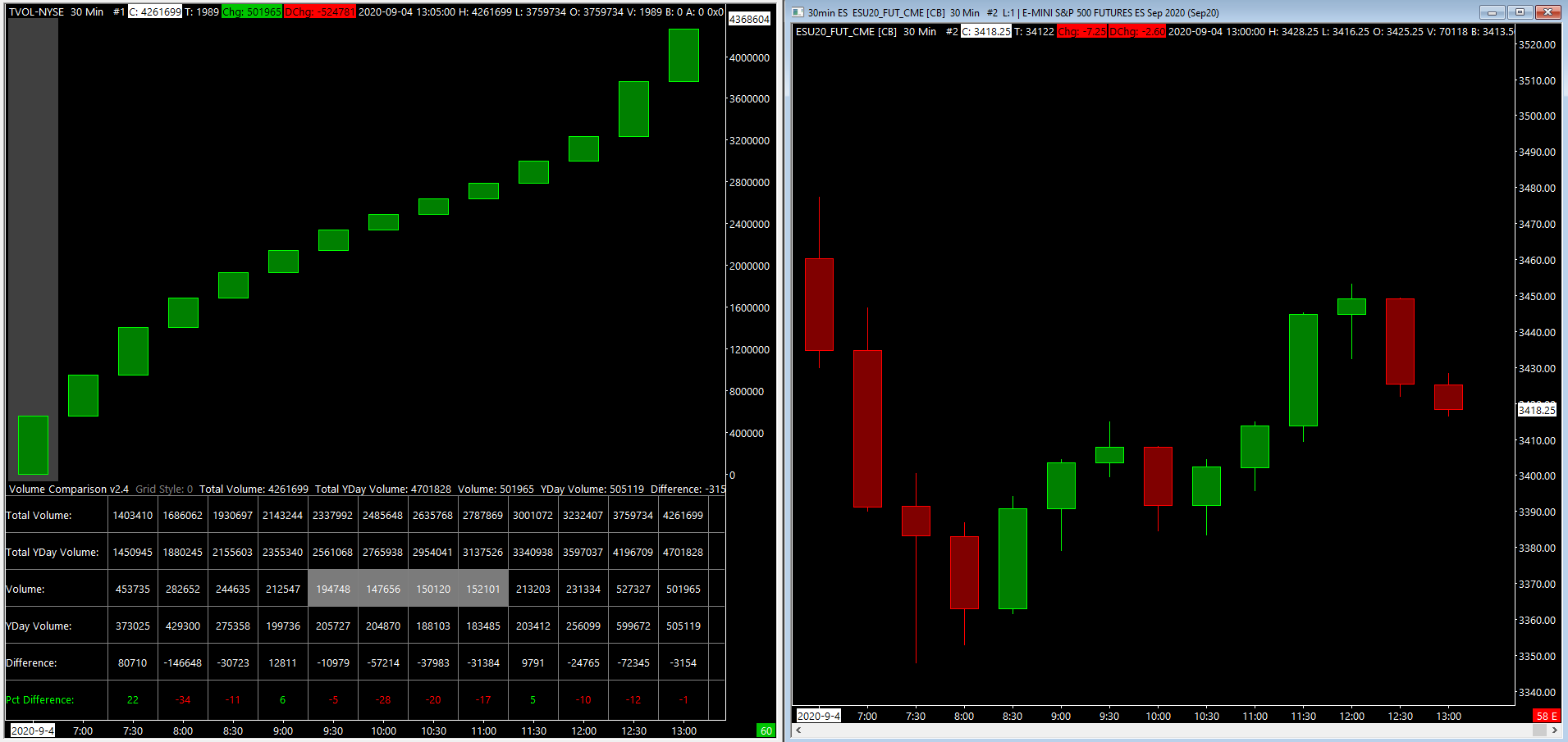
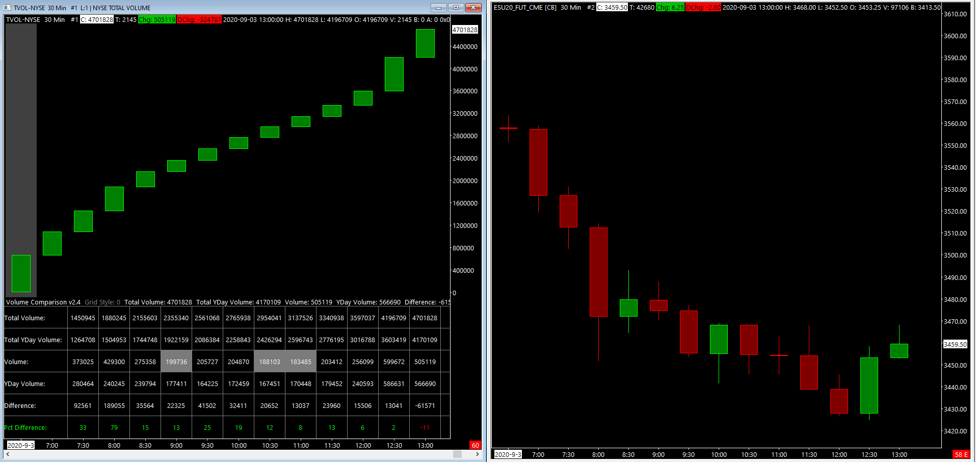
Hello everyone. This is Ralph. And today I’m going to show you how to set up the volume comparison study. This is different from the volume ticker comparison study, and we’ll have videos for that one. So please don’t confuse the two. So I want to tell you what we’re looking at right now. This is a 30 minute candle chart for the total volume going into the New York stock exchange.
Each candle aggregates the total number of contracts that haven’t traded on the exchange. And we’ll talk about how to use this to your advantage. On the next video, I built the study because I was getting the data from Dalton’s website, which many of you are probably familiar with and I’ll show you what that is.
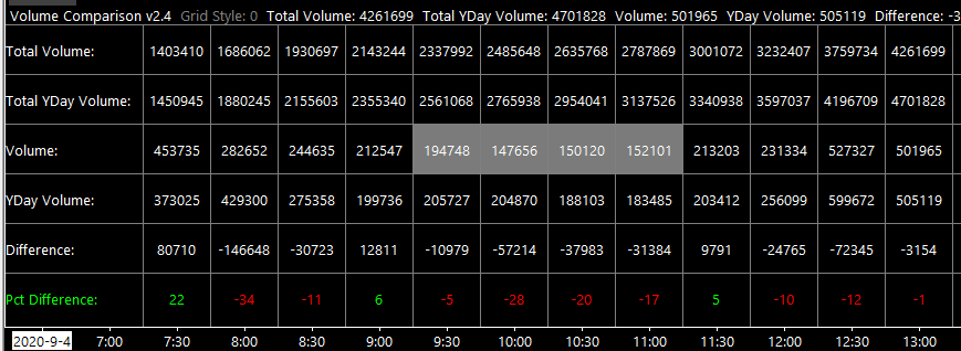
So he has this table on his website that shows you per 30 minute period, what the volume was today and what it was yesterday. And then it tells you the difference. It’s pretty straight forward.
I prefer to have all the data and Sierra so that I don’t need to be switching over to my browser. So let’s add the study, open up your charts, study settings,
click on add custom study and instead of loading up the volume ticker comparison study, open up the volume comparison study. Once you add the study to the chart, open up the settings panel. This study is pretty straightforward. There’s only three different inputs. The font size, the minimum regular volume, which is asking you what the historical average is per candle.
I’ve gone through and calculated this for the New York stock exchange. But if you’re using something else, you’ll have to do this calculation on your own. Lastly, the low volume color, which simply highlights a cell whenever the volume is under its historical average. So let’s add this study to our chart, back to the chart.
You can see, we didn’t have a new table at the bottom. This is the same data that we were just looking at on Dalton’s website, but now you have it here in Sierra chart. Another thing that I’ve done, similarly to what I did to the volume ticker comparison study is I aggregated the data for the last eight years.
And then I calculated what the average volume was per period. And you can see that some of the periods are highlighted. This highlight indicates that the volume is under its historical average. And this is a nice visual feature that you can use when you’re glancing over this chart during the trading day, that’s all for now.
Please watch our next video on how to use the study in your everyday training until next time everyone happy trading.