Below is the transcript of the video you’ll get access to with your subscription.
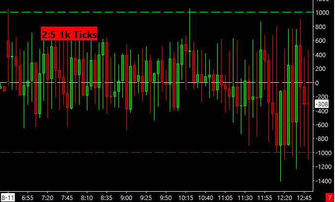
Hello folks, this is Ralph. And today I’m going to show you how to set up and use a very simple bubble that I created. We’re currently looking at a 15 minute chart of the NYSE TICK. And in this chart, I’ve added three lines. The zero line. The plus 1000 line and negative 1000 line. These are the two extremes that we want to track.
And this bubble will tell you how many times we’ve crossed each extreme. So if we look at this particular day that I’ve picked and I wanted to find a day that had a few different crosses in both sides. So I picked this day and you can see that we cross the positive 1000, twice. Right here and right here.
And we crossed the negative 1000 four times. This one barely. And then these three. So let’s go ahead and add the bubble and you’ll see, there should report that exact same data. Click on add custom study and under statistics bubbles, you’ll find the 1k tick count bubble. Add that to your chart. Now let’s go over the settings.
So as most bubbles that I’ve created, they all allow you to pick the different chart number for you to plot that bubble on for now, we’ll just pick this chart, but you can move it anywhere you want the next input. Is a filter. And this filter is a condition that prevents us from counting when we cross that extreme.
If the candle for the tick closes on the other side of the zero line. So for example, on this particular bar, we cross the plus 1000 extreme, but the candle itself closed under the zero line. Meaning closed negatively. So this means that I don’t really want to count in that extreme cross because likely price kept trending down.
And, you know, I think if I pulled this day up of the e-mini S&P’s, we would see that we traded lower and you can see this by what the ticket showing us right? So I would like to filter out that data, the input itself defaults to No meaning this extreme will be counted, but you can always flip it over to Yes. And we’ll see how that looks in just a moment. The other four inputs simply revolve around how we display the bubble. So we won’t go over those. So let’s hit apply and then, okay. And then we’ll have to reload the data to make sure that the bubble appears. And here you have it just like we talked about, it’s a 2:4 ratio.
The positive crosses always go first. And then on the other side of the colon are the negative crosses. So if there were no positive crosses, you would just see 0:4. All right. So it’s that simple. The last thing I just want to show you is switching over that input, which has that extra condition from No to, Yes.
Let’s save it and then let’s reload the data again.
So now you can see, we filter out some of the data here. We already went over the positive tick, extreme that we filtered out, but then there’s also a few negative ticks that we filtered out. And you can see that by the data in where the tick bars closed. I’m going to switch the timeframe from 15 minute chart to a five minute chart.
And then you’ll see how the tick bubble also updates. Now you can see that this one is counted because it closed above the zero line. So you can see how the data changes from time from to timeframe. And it’s only based on the underlying data of the chart. So I hope that you found this useful and you can incorporate it into your everyday trading. Until next time everyone, happy trading!