Below is the transcript of the video you’ll get access to with your subscription.
The Advance Decline Ratio is provided by Sierra Chart as a market statistic.
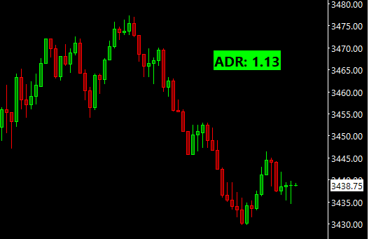
Hello folks, this is Ralph. And today I’m going to go over how to set up and use a very simple bubble that I’ve created. We’re currently looking at a 5minute chart of the ADR for the NYSE, as you can see up here, if you’re not familiar with the ADR, it’s very similar to the breath bubbles. So it’s telling you how many stocks in the NYSE are trending up or down compared to their previous value.
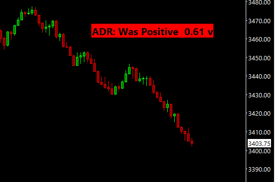
And this is just the statistic that is provided by Sierra. So this ADR, which is advanced decline ratio will always plot a value that is above zero. So this ratio’s zero line is actually one, and this is why a plotted a line at 1 right here. You can see that on Friday, we opened up pretty negatively, but quickly the ratio became positive.
And that’s an important piece of information, right? We open negatively. There’s been a shift in the market considerably that now most stocks are trading positively. And just to give you an idea of what a strong ratio is on the positive side, I would consider a strong value to be above 0.5 in a value above two is really strong.
So as you can see, we didn’t really get above 1.5 and then we started trending down again on the downside. I would consider 0.5. So all the way down here to be a very strong down day and then anywhere above it, I would probably say between 0.8 to 0.5 would be a decent trend to the downside. But it may not be as strong.
That is all. So that’s a chart that we’re looking at right now. I’ve also added another chart. This is just a 5,000 trade chart of the e-mini S&P’s. That we want to plot the bubble on, because I actually don’t want to be looking at this chart all day. I want to be looking at my main chart all the time and that is that 5,000 trait chart, hypothetically. Right. So let’s go. I hadn’t had the bubble and look at it on that chart. Click on chart studies. And then click on add custom study under statistics, bubbles, you’ll find the ADR bubble, add that to your chart. And then let’s open up the settings panel.
You’re probably familiar with this by now, but I have this input that asks you which chart number you want to plot the bubble on. And it defaults to the current chart, but I know that the chart of the e-minis that 5,000 trade chart is one. So we’ll change this 2 to 1. The next input asks you to give it the underlying data for the ADR.
So that’s actually going to be the main charts data. So you have to select a main price graph and then use the last value for each candle. Next. The third input allows you to detect a trend and asks you how many candles looking back. Do you want to see if we can do the trend either to the downside or upside.
So if we look at the data over here, once were say at this red candle, the algorithm will look back 4 candles and say, are we trending down? And if yes, the bubble itself will let you know that we’re trending down that way. You don’t need to come over here and look at this data. And that’s something I really, really like the next four inputs are not really relevant, they’re just how the bubble displays. So we will skip over those.
Now let’s add this to the chart. So if we flip over to the 5,000 trade chart of the e-minis, we should see the bubble. Perfect. So you can see that the bubble is telling you the last value that is plotted. If we go over to the ADR chart, scroll over to the right, it matches this 0.99, nine value.
It’s almost at the 1 line. The other thing that I told us was that we were previously negative or positively on the day in this case, because we’re currently below that one line, it’s going to look back and see if we were considerably above the one line. If we just poke over just breifly, and then come back down, it won’t really count that as we were consistently above the one line.
And this really house, because it can tell you if there’s been a considerable change in the market and we went from the majority of stocks trading positively, negatively, or the other way around. So going back to this 5,000 trade chart, you can see that data of the last value if we were previously positively or negatively.
And then one thing that we’re not seeing right now, because of the data that is currently being plotted is the current trend. There is currently no trend detected for the data that is plotted right now. But like I was saying, if we were trending up, you would see a little carrot right here pointing up or inversely trending down, you would see carrot pointing down.
And that is it. The idea is just to be able to extrapolate that data, build some analysis that you would do in your brain anyways, and then show you that data in a little bubble. So I hope that you can incorporate this little bubble into your trading and until next time everyone, happy trading!