Below is the transcript of the video you’ll get access to with your subscription.
Hello folks. This is Ralph. And today I’m going to show you how to set up the cumulative tick study. So let’s get started. Right now, we’re looking at a chart that is simply plotting the tick for the NYSE. And this is a 15 minute chart and we’re loading 30 days on this chart. It’s pretty straight forward.
And then I just have three lines on this chart, the zero line positive 1000 and negative 1000, just pretty standard tick chart. I know some people use different timeframes. I like to look at the 15 minutes. So that’s what I’m going to show you today. So let’s go ahead and add the study. It’s pretty simple.
Um, the hardest part is really just setting up the chart and making sure that you have the right symbol. So if we’re looking at the tick for the NYSE, make sure you use TICK-NYSE in Sierra. Otherwise I think it tick dash NASDAQ. So let’s open up charts, study settings, click on add custom study, and you’re going to find the study under tick statistics, and then add the cumulative sum study.
There’s actually no inputs for this study, but there are sub graphs in case you want to change the colors of the bars, but we’ll just leave it as it is right now. Click on apply and then hit. Okay. Now the cumulative study essentially just adds up. It’s essentially a sum from the beginning of the day.
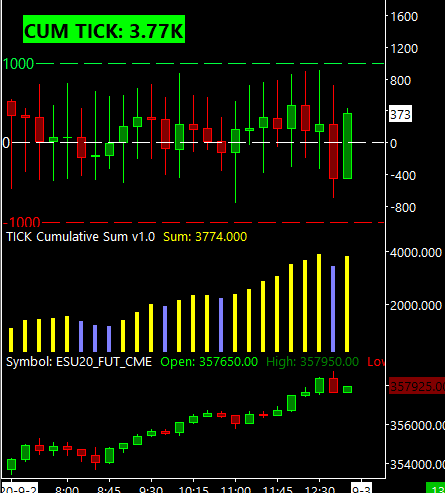
Till the end of the day of the closing values of each 15 minute bar in my case. So as you can see if the TICK continuously closing positively, you’re just going to have this trend up. But sometimes, especially in the mornings, you’ll see the tick, you know, it’ll close below the zero line for a few times, and then above the zero line for a few times.
And sometimes it’ll chop back and forth. Until the market takes a direction and then you just start seeing it build and build and build. So then essentially is it, you don’t need to do much to set it up. Um, but before I let you go, I want to show you that we can also pull this data into a bubble. You guys probably already know this about me.
I love using little bubbles that I can play some other charts to essentially extrapolate that data and put it all together into a single chart that I can glance over. So I don’t need to have necessarily this 15 minute chart anywhere on my screen, or have to flip over there all the time. Just the data’s already there, um, as a bubble.
So let me show you how to set that up. Go back to chart. Study settings.
Click on add custom study. And now you want to find the statistics bubbles.
I didn’t create a statistic bubble directed to the cumulative sum study, but rather you can use the generic stat bubble, which is just called internal stat bubble. Add this to your chart. And then we’ll open up the settings and you simply need to point it to the cumulative study and just pick SUM as the data that you’re feeding into this bubble.
It asks you if you want to give it up prefix. So what we’ll just call it. CUM TICK with a colon and we’ll place it right now in the current chart that we’re looking at, which is chart number 2. And then this 4th input, which is something that allows me to rely on this bubble without having to flip over to the chart all the time.
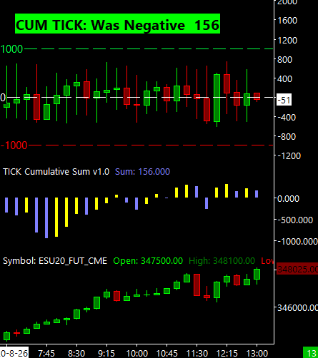
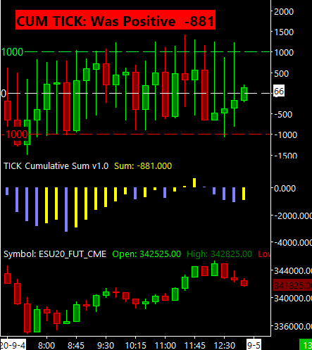
It essentially can track if the underlying data was previously below the zero line and now is above the zero line, meaning we went from negative to positive or the other way around. But you need to give it a value of what is considered acceptance above or below the zero line. Because if we just dip one point over or under, you don’t want the bubble to tell you that we were previously on the other side, you want to know if we actually spent time on the other side.
And one way to do that is by giving what I call this minimum. We’ll change it to 650. I think that’s a good value for the cumulative tick. Then it asks you, if you want to detect a trend, which I’ve also gone over in other videos, but essentially picks up if, if the data is trending,
if you want to use decimals and then the rest of the inputs are simply how you want the bubble to display. So we’ll just apply this as it is now. And then. It looks like we, we need to reload the chart simply because this is not currently updating as the market is closed. And now you can see that the cumulative tick data’s here.
Apparently I didn’t have to add that extra colon, but yeah, there you have it. As you can tell, the data is trending down right over the last for looking at this last value, the previous four values are above it. And this, the, this last Valley is below. Therefore the data is now trending down and that’s why you get this carrot pointing down.
And the bubble is red, even though the sum of the cumulative TICK, it is positive. And that’s an important piece of information on the next video. I’ll show you how to use the cumulative TICK and I’ll bring up a chart of the e-mini S&P so that we can compare the data with the data that we’re seeing on this chart right now.
So please go ahead and watch this video until next time everyone, happy trading!