Internal Market Statistics
Below is the transcript of the video you’ll get access to with your subscription.
Hello folks, this is Ralph. And today I’m going to show you how to set up a use, a very generic bubble study that I’ve created. And this study allows you to feed it any underlying data. So you can think of the TICK, the net volume for the NYSE, whatever you want. And then it extracts data out of that data and it presents it into a bubble.
And that bubble basically will give you three different types of information. The current value for that data. If the data is currently trending in a direction, either trending up or turning down, if it’s not telling you a direction, then that means it’s neutral. And then it’ll tell you if the data was previously, positively or negatively on the day.
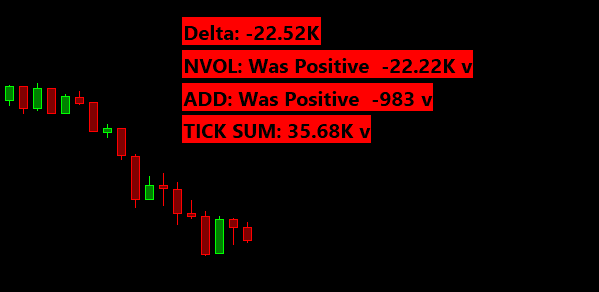
So take Delta as an example, it’s very useful to know if Delta was previously negative or positive in the day and what the value is right now of that Delta. So let’s go ahead and add Delta, and then let’s add the bubble for Delta so that you can see how it works. We’re currently looking at a five minute chart of the mini futures, and I haven’t added anything special besides the blue background that you see.
So let’s go ahead and get the Delta and we’ll just add the volume Delta. Everybody has a preference, but we’ll just use volume for now. And then if I apply this, now you can see the sub-graph being added. So again, You can see the zero line in really works best. If you have data that has it zero line, you wouldn’t really want to give the bubble data such as another instrument, like the Russell or NASDAQ, okay? So if we look at the zero line right here. You know, the market opened around this, around this area right here, and sure enough, a dip probably a little bit under the zero line, but then it was just positive the entire day. Right. And then the algorithm is smart enough to tell you, Hey. You know, we were only positive on the day.
We really didn’t go negative. So it’ll tell you that information. It’ll also tell you the latest value for the Delta. And then finally, it’ll tell you throughout the day, if we’re trending up or if we’re trending down, as you can see in different parts throughout the day, and then, you know, when we’re trading sideways or when the data is pretty flat, it won’t tell you that there’s currently a direction.
Okay. So let’s go ahead and add the bubble and you’ll find the study under statistics, bubbles. And it’s called internal stat bubble. Now, if we look at the settings, let’s just go over the inputs here. So the first input asks you which chart you want to plot the bubble on. It fills in the current chart number, and you can find the chart number next to the # sign up on the title bar.
So you can pick any chart on your chart book. The next input asks you which base data you want to give it. So in this example, we’re just going to pick the Delta. And we’ll use the closing value for each candle. Then the next input asks you to give it a name for this bubble. The idea is that you’ll be adding more bubbles to your chart and you want to distinguish between them, right?
So we’ll just use Delta here. And then the next input is what allows the study to tell if we were previously negative or positive on the day, but you don’t really want it to tell you if we barely dipped negatively, such as we did today, you really want to know if we went significantly under the zero line and it works the other way around as well.
So for Delta, I’m simply going to use 1000 for now feel free to type in whatever value you want. It’s totally up to you and your preference. The next input allows the algorithm to detect a trend, but it asks how many bars you want to look at to tell if those bars are trending up or down, it defaults to 4, but if you’re using a shorter timeframe, I recommend you use a higher number, maybe six or eight, but you should play around with it so that you can get a good feel for it.
And then finally the use decimals input just has to do with how we display the latest value of the data. So it really depends if the underlying data has decimal values or not. And if those decimal values matter to you, so it’s completely up to you, but you can toggle this back and forth. We’ll just leave it at no for now with Delta.
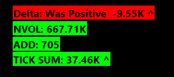
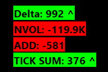
And then the next four inputs just relate to how the bubble is displayed on the chart. We won’t go over those. So without further ado, let’s go ahead and add the bubble. Hit apply and then hit. Okay. And now we can see the bubble being added over here and it shows the latest value. And then this little V right here, it’ll either be a V as it’s shown right here, or a carrot ^ pointing up.
And that’s what can tell you if the data is trending up or down. Last, but not least waht you don’t see here is the bubble telling you that we were previously positively or negatively on the day. And it’s going to be hard to show that to you right now, because the market’s closed it’s Friday after the close.
So the algorithm already thinks that we are opening up a new session, which will happen on Sunday. So it’s going to be really hard for me to show it right now, but just trust me that it will show up. So hopefully this explains the bubble and you know, this is something that you’d want to use and. Put on your charts.
So what I want to do next is just go through the same process with other data. And, you know, if you want to stick around and get the values that I use for those datas, then feel free to stick around, but we’re just going to go through the process three more times, hopefully a little bit faster now. Okay.
So to start off, I’m going to add the net volume for the NYSE and, and I’m just going to add the data first. So I’m going to use the add additional symbol. And this is just going to load the data and you’ll see it, a new sub graph. Okay. And as we can see, the, the NYSE Volume basically sold for most of the day, even though the market went up, that’s an interesting thing on its own. So let’s go ahead and add the bubble now to it.
Select the base data of the NYSE net volume. Again, we’ll use the last value for each candle. Give it a name. And then, you know what matters here is going to be what’s the minimum value, what we would consider if we want positively to actually have gone positively on the day. And I think for now, we’ll just use 200,000.
We’ll leave the trend detection the same, and then the use decimals, the same. Add this to the chart. Here we go. So now we have the net volume added. One thing that it does is that it contracts the number. So you don’t have to see negative 1,260,000 instead of contracts it to 1.26M, which I think is pretty neat.
So you can see that this number matches the number down here, and there’s no trend detection because right now you can see the latest values to low confusing, because again, the market’s closed and the net volume for the NYSE doesn’t update in after hours. So you’ll always see it just flat. So it’s not trending as it’s flat.
So that is the net volume for the NYSE. Then let’s go ahead and add the advanced decline lines. So we’ll add another additional symbol here in Sierra chart calls it NISS-NYSE. This is the name for the advanced decline line for whatever reason. So let’s go ahead and add the bubble for it.
And one thing that you can also do here is give the bubbles names so that they make sense in this list, right? So that you don’t see internal stat bubble, internal stat, but one turn a stat bubble. Instead, you can give it the name for the bubble and you’ll see it update here. Once we hit apply,
select the right base data, and then. We’ll just call it, ADD, you could also call it the NISS depending on whatever you want.
I’m just used to ADD because of Think or Swim. And then I think we’re going to leave the minimum value as is right now as 450. We’ll also leave the minimum trend untouched and let’s go ahead and hit apply, and okay, there we go. Now we have our advanced decline line bubble in same thing. You can see that it matches the number down here.
Alright. So the last data that I want to add is the cumulative tick data. But what’s interesting about this data is that we are going to be chaining two studies that I’ve created. So first we’re going to add the base data for the cumulative TICK, which is going to be just the TICK data. So this is TICK for the NYSE.
And then we want to add the cumulative study, the cumulative of sum for the TICK. Okay. And there’s a video that will show you how to set this up. So I won’t be going over that right now, but now if I hit apply, you can see, you know, the sub graph that I’ve created added to the chart. And now what I want to do is use this data.
As the source for the bubble. So let’s go ahead and add that.
And now we select this data for the cumulative sum. Make sure that you select the right sub graph from this dropdown. We’ll just call it TICK SUM. And we’ll change this value to 600. We’ll leave the rest of the values as they are. And then let’s add this study.
Beautiful.
So now you can see how easily we added these bubbles for all these different datas. And now what you can do is build a chart that has all of these underlying datas that maybe it’s not that useful to have on your screen at all times. And it allows you to A) clean up your screens. B) keep you more focused, but still be able to glance over and see what the value is right now for all of these datas and see if they’re trending and if there were previously positive or negative on the day, and that’s the whole reason why I created this bubble. So I hope that you find this useful and can incorporate it into your trading. And until next time everyone, happy trading!