Below is the transcript of the video you’ll get access to with your subscription.
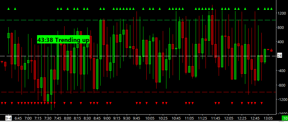
Hello folks, this is Ralph. And today I’m going to show you how to set up the tick distribution study. So let’s go ahead and get started. We’re looking right now at a 15 minute chart of the TICK for the NYSE, as you can see up here, and we’re not loading the overnight session because you know, there’s only TICK data during the day.
I have just three lines on this chart and that’s the only thing that I’ve done. One of them plotting the zero line. And then the other two app positive 1000 and negative 1000. So let’s go ahead and add the tick distribution study, click on add custom study and then under tick statistics find take distribution.
Simply add this study. If we open up the settings panel, you’ll see that there’s no inputs. This is a pretty simple study. There’s some sub graphs where you can change the colors of the triangles that’ll plot. So let’s go ahead and add this and see what it looks. Okay. All this study really does is plots a little triangle, either pointing up or pointing down, depending on which side of the zero line that bar closed.
Okay. So if we zoom in, you can see that this green bar closed barely green. So therefore plots a green triangle right up here and so on and so forth until this red one closes negatively, and then you get the red triangle. So pretty simple stuff. I will show you in the next video, how to make use of this data.
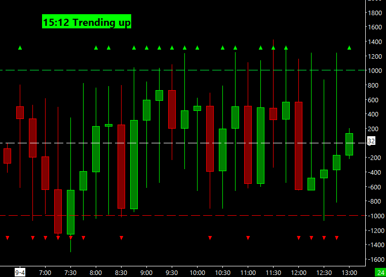
One other thing that I want to show you, how to set up is the bubble for the TICK distribution. As you already know, I really liked the bubbles. So let’s go ahead and click on add custom study and go to statistics bubbles in here. You’ll find that tick distribution bubble. Add the bubble and then open up the settings.
Very similar to all the other bubbles that I’ve created. You can select which chart you want to plot the bubble on. You can select the length of the trend. And this one has a, an extra input, which allows you to select which data you want to use to calculate the trend. So this can be the last value of each candle.
It could also be the open, the high, high-low average, whatever you like. So we’ll just add this click on apply. We’ll have to reload this chart. Just to make sure it shows up. And now you can see that over this last day, we had 13 positive closes and 14 negative closes. So this way you can plot the bubble and another chart in, at a glance, you can see where the tick has been closing over time.
And since right now, I’m showing a 15 minute chart. If I were to change this to a five minute chart, You’ll see how the bubble changes as well. Obviously now there’s more data and you get more tick plots. So it’ll calculate accurately. That’s really all. I wanted to show you on how to set up the tick distribution.
Please watch our next video on how to make use of this data for your trading until next time everyone happy trading.