Below is the transcript of the video you’ll get access to with your subscription.
Hello folks, this is Ralph. And today I’m going to show you how to use the ended auction study. If you haven’t already done. So please go ahead and watch the set of video so that you can get set up with the chart that you’re looking at right now in your Sierra Chart chartbook. All right. So I haven’t really done anything to this chart.
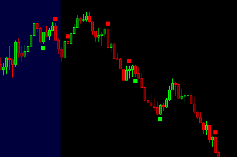
I’ve only added the ended auction study with the default settings, nothing has changed and you can see that there are a few plots on this particular day that I picked. I’m actually doing this video a few days later from the setup video. So, um, we’re fast forwarding here a little, but you can see, you know, sellers.
Buyers buyers and sellers. And again, what the study is doing is it’s telling you, by looking at the order flow of each candle, there are more buyers or sellers at each extreme of each camera. All right. And it doesn’t always work out. And one thing that I want to mention is that these little plots, you know, these little squares that are getting plotted are not trading alerts.
It’s very important for you to remember that. Unlike other studies that we have, which are trading alerts, This is just telling you what is happening at each candle. And you could take it as an alert, but that is not how it was designed. Okay. And you’ll see that often it’ll work because that’s what it’s looking for.
It’s telling you that there are more buyers than sellers at these lows and then price. Sure enough just goes up. So actually the way that I like to use this study is in conjunction with other things. So whatever training system you use, you would want to plot this study along with whatever system you use.
And whenever you take a long or take a short, you’d want to watch to see if either sellers or buyers and coming in, and then you can make a decision based on if you’re long or short. So, one thing that I do want to do is I want to loosen these settings up a little bit. By default, the settings are very restrictive.
So let’s go ahead and do that. I think I mentioned that this particular implant looked for double tops and double bottoms. And by default, we look for exact tops and double bottoms. So you can see there was a previous low exactly to the tick of this candle that actually gets this plotted square, but we can loosen them up by increasing the number of ticks and we’re looking at the e-mini S&P, but as you can see right up here, so the e-mini S&P has 4 ticks per points. So this is basically just asking you how many ticks away. You want to look for double tops and double bottoms. Let’s just do two for now. And we should see a few more plots maybe on this day.
I actually didn’t go through this before, but you can see that. You know, a few more come through this area right here. If we do four, you’ll likely see a lot more and it really just depends how many more or less plots you want to see? You’ll see that during some days more plots will just work better. And I think, you know, throughout this day, Very choppy day, right up, down, up, down and so on, so forth throughout the entire day.
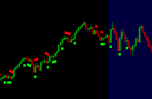
So let’s see if we can find a trend. This is actually a pretty good trend. What would have been nice to see is, is the seller still selling these tops or these little rallies. I’m sure we can find another day similar to this. So this one’s interesting, right? So we’re moving up, but either they’re sellers right through here, or there are players who are long and then they’re taking their, their longs off, but there’s clearly still buyers in this market.
So this would have been kind of a false signal for me. I think if we let’s see if we change these things a little bit, so we’re just, you know, for the setting, let’s see how this looks. Yeah, so it’s a lot noisier, right? And you can see it also on the way down, there were buyers probably thinking that they were getting a deal now, as the market had gone up, expecting another rally up and on this little pushup seller stepped in and then they sold the market.
So again, this is why you don’t want to use this as. A trading signal because sometimes this is what will happen. You’ll just get, run over, over and over again. I much rather use it if I’m long from who knows maybe in the beginning of the day, somewhere around here.
And then I start seeing all of the sells, it would prompt me to exit the market unless something else is telling me not to. So it’s just adding another piece to your puzzle of potential probabilities of where the market’s going to go. Let’s see if we can do one more change here. So one of the things that it requires is clustering by default.
Just go ahead and turn that off for now. And I actually will want to turn this back on because otherwise you’ll just get too many plots, if you would turn both of them off. So. Yeah, this is to me. This is too many signals now. This is not that useful. There’s just looks like Christmas, all over the place with these like green and red, a little plots.
So I would likely just change this to, or go back to the default settings and see now with two, you get better signals. So there are sellers, and then this would keep you. From going long or potentially entering the market short at some point in time. I think this day was, was just different and that’s what happens.
That’s, that’s just the market, right? Other days it’ll work really nicely where, you know, the longs will long and then sometimes you get this conflict of indecision and then one side wins and then it sells off. And then, you know, we got another little rally. You start seeing the sellers, some buyers. And then it sells off.
So I think we’ve lately we’ve had some, some pretty choppy days. I think observing them, you know, buyers, sellers, you see that indecision, where’s it going to go? And then you wait potentially for the breakouts. But it’s giving you just a different view of the market that you can’t really see by just looking at the candles themselves.
So I would actually recommend you use this with the default settings, because again, they’re very restrictive. And the reason for that is so that you don’t get so many conflicting plots like this one right here, so, do that. And then as you start getting more comfortable, you can change it throughout the day.
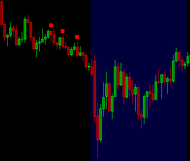
One thing that I’ll sometimes do is on a, on a big trend day like this, I like to see if the sellers are stepping in again at the little rallies. So sometimes, and you have to ignore a lot of the noise is you can actually just go in and make the setting super loose. Okay. And then if. If I’m not already short, I would say we want to see sellers stepping in right here to then short the market.
In fact, you see them right here, which this would lead me to, to go short. and you have to ignore some of the other plots just because you’re only looking for a specific thing to happen. And if it does, then you can jump in with them. Same thing right here. But I think right here, you had a little cluster of now buyers are stepping in through here and through here. And then we, we rally up, even though there were still sellers, I mean, sellers are now, you know, selling into a hole down here. So it’s harder for that to work out versus when the trend is just starting or throughout the middle of it. So anyway, I’ll leave it at that.
I hope you learned something throughout this video and you can use this in your everyday trading, until next time everyone, happy trading!


