Below is the transcript of the video you’ll get access to with your subscription.
Hello folks, this is Ralph. And today I’m going to show you how to set up the exhaustion detector study in Sierra Chart. All right. So right now we’re looking at a 5,000 trade chart of the e-mini futures, as you can see right up here. And what we’re going to do is just add the exhaustion detector study. It’s a very simple study.
There’s not much to it, but I’ll explain how it works and what the inputs are for it. So let’s open up charts, study settings, and let’s add it. You’ll find it under exhaustion detector. And you can add this to your chart. If we look at the inputs. There’s actually only three inputs to this study. So it’s a very simple study.
The first input will tell the algorithm to hold an alert from plotting for a certain amount of in this case 10 seconds. The reason being is that sometimes an exhaustion can be detected, but because price keeps moving in the same direction that exhaustion will be taken away. And we’ll go over that in just a moment.
The next input allows you to visually plot the alerts further away or closer to the candle if you want. So from the high or the low, you can plot it closer for their way. And then finally, the last input is related to the first one. So if you want, you can have an audible alert, for Sierra Chart, or if you have audio alerts configured in Sierra Chart that you like, you can select one from this dropdown.
And then not only will the visual, so alert plot on the chart. You’ll also hear the Sierra Chart audio alert. It’s also related to the first input because it won’t play the audio until after the 10 seconds have passed. So that’s basically it, there’s not much to it. So let’s go ahead and apply this. And now you’ll see all the different alerts plotted on the chart, the chart, normally it needs to reload because I need to load all of the order flow data as this data is needed by the study.
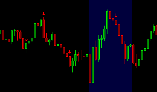
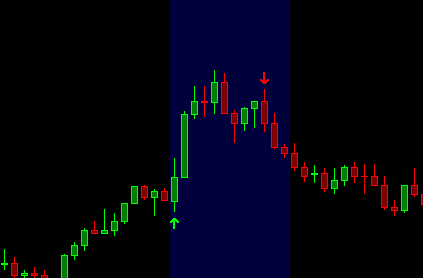
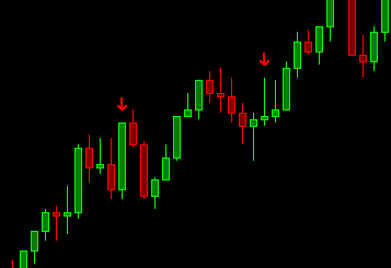
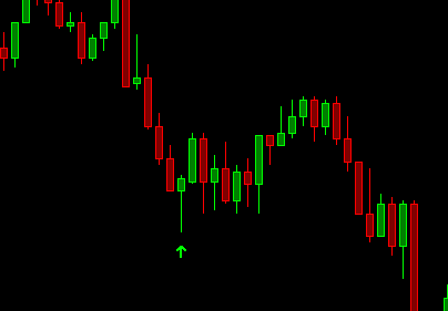
So now you can see all of these different arrows. Telling you that there were exhaustions and normally how you’ll want to trade. This is by trading against the exhaustion. So that’s why at the top it’ll play out and the arrow pointing down, meaning you should short it at the bottom. It’ll plot, a green arrow, meaning you should go long.
So now, if we talk about that delay input, that first input that we have set to 10 seconds, we want to wait before planning and alert, because it’s possible that as price, for example, in this big green candle, as prices moving up and exhaustion is detected and obviously a detected one at the very top anyways, but it’s possible that detect it some along the way.
But within that candle price was moving up so fast because there were still more buyers in the market that still wanted to keep buying the market that we don’t want to plot the exhaustion just yet. We want to wait at least those 10 seconds. And if the exhaustion remains as it was at the very beginning, we want to then plot the alert.
So hopefully that explains that input well. And I’m just going to leave it at that for now. Please go ahead and watch the next video on how you can use the study in your training. So until next time everyone, happy trading!