Below is the transcript of the video you’ll get access to with your subscription.
Hello folks, this is Ralph and today show you how to set up the famous Jobo pinch it’s by far one of the most popular studies, along with the reconstruct the tape. So I highly recommend that you watch this whole video so that you can understand how to get the most out of this study, and you can understand how to set it up and then trade it on the next video.
All right. So let’s go ahead and talk a little bit about the mechanics of the JoboPinch. It uses the ADX and the MACD. So it looks at both of those training indicators and then based on those two, it decides if it’s essentially in a pinching mode and when the pinch releases that’s your time to buy.
So let’s actually visualize some of this information. All right. So let’s go ahead and add the MACD first to our chart, and then let’s add the ADX. Now, if I hit apply, you’ll see these two subgraphs being added right now. We’re looking at a 20,000 chart of the e-mini futures, just for some context. So. Every new bar is 20,000 trades.
And the way that it works is that JoboPinch is looking for these pinching conditions. Right? So if we look at the MACD is coming down, ADX going up and it’s creating this pinch effect, right? And then at some point in time, pinch releases, both indicators go their separate ways, and that is your time to buy.
So at a high level, the JoboPinch is looking. For conditions where the market is oversold. And it’s telling you when to buy the Jobo Pinch, wasn’t created for shorts, even though you can do that, I’ll create a video later on how to set that up, but just know that the Jobo Pinch is four longs only. Alright.
So now that you understand some of the mechanics and obviously the algorithm is hundreds of lines of code. So it does a lot more than this. I’m simplifying it a lot, but it’s looking for this pinch of condition at a high level. So let’s go ahead and add the Jobo Pinch here and actually take a look at how it plots.
So under add custom study, you’ll find the Jobo Pinch. And then if we open up the settings, the first thing I’ll do is I’ll just configure it so that we can see it. So if you go on under. The settings and you’ll find the MACD and ADX indicator inputs. You essentially need to point the two drop downs too.
The MACD and ADX studies that you’ve already added. So here’s a list of all the studies available available on this chart. You’ll just select MACD for the first one, and then ADX the second one, if the Jobo Pinch is just ever not working for you. Please come here and take a look at this because this is 99% of the issue that people have with not getting the Jobo Pinch working on their system.
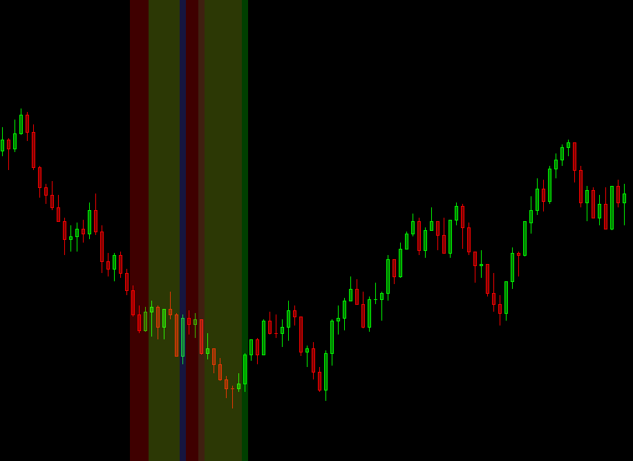
So please go in here and check it out. All right, now that I’ve hit apply. You can see there’s a bunch of different backgrounds that get added different colors onto the chart. And the way that it works is these colors essentially mean different things. The last color that plots is always going to be a green bar. And that is your signal. That’s your trade alert essentially, to go and get long. So you get long right here and, you know, depending on how long you hold it, you could get. Up to 25 points or so, same thing right here. You get a few points. You may get stopped out, you know, who knows some work a lot better than others and just depends how long you want to hold them for.
You know, I think it’s going to be hard to hold through this area, but anyway, so I mean the main color that you’re going to be looking for is going to be this green release. There’s other colors that we’ll talk about. And if you go back to settings and we open up the trunk, Jobo Pinch, and look at the sub graphs, you’ll see what each one of the colors mean.
So the red color is essentially telling you now we’re pinching. That’s going to be the default value. Whenever a pinch is quote unquote “open”. So we’re pinching, it’s going to be red. Then the next color is orange, which means that we’re in an optimal pinch. That means that the readings for both the MACD and the ADX are getting to such an extreme that the probability of the pinch releasing soon is higher than before.
And also you’re going to have a bigger trade if this pinch had an optimal pinch. So just to step back again a little bit, if we look at. You know, this pinch right here that released. And we look at this pinch right here that released. The one with the optimal pinch had a much larger move up, then this other pantry here, and, you know, that’s how you want to use it.
And it doesn’t mean go along through any of this area. You just do not want to go long until the study tells you to go long. It’s very important to follow the rules. That’s why it was created. All right, the next input, pinch ending. So this gives you a visual alert that the pinch is about to release, and you can see it right before this green candle.
This candle right here. I believe it’s this color. It might be the pinch with our aside, but let’s just assume it’s pinch ending. You can see it on this other pinch release, the pinches ending, get ready to buy. That’s essentially why it changes colors. And then the pinch ended. We already talked at nauseum on this one, the failed pinch.
So we can see a few of these failed pinches on the screen. This one is questionable, but it did fail according to the algorithm. And essentially, you know, if fails when rice continues down. So if the algorithm detects. That you know, the MACD and ADX now pinching again. Then the pinch gets restarted.
And what used to be a background that was green is now medically switched from green to blue. Tell you, Hey, get out of this trade. And here’s the historical information that we had released the pinch right here, but it failed. So this study won’t, you know, repaint or lie to you. It’ll tell you, Hey, you know, there was a pinch here, but it failed.
And that’s just what it is. Right. But at least you have that information in front of you. And then lastly, we’ll skip over this pinch value, but the next one is going to be this pinch with our side. We’ll talk about the inputs for the pinching, with our assignment. You know, we’re looking at MACD and ADX.
Now we’re adding another layer with RSI. And if the RSI is also at an extreme reading, we will change the color of the background. So you’re having more of these things stacked on top of each other. Let’s just call them probabilities. And when the probabilities are at their best, that’s when you’re going to get the best pinch releases.
Again, this study works really well over time, but it’s also how you use it and how you take the highest probability pinches, you know, lower probability pinches. You maybe want to go with smaller size, higher probability, you want to go with larger size so you can bank on those big opportunities. Alright, now let’s talk about the inputs.
So these first two inputs, essentially tell the algorithm, when can we open up a pinch? When does a pinch start pinching and you know, it looks for a MACD reading that is lower than one and an ADX value that is higher than 12. So if I just move these windows over a little bit, and let’s zoom into this pinch right through here, you can see that the MACD is definitely lower than one, and the ADX is greater than 12. Whenever this pinch opens up, it also looks back a certain number of candles to make sure that the same conditions are met for the previous candles. Even though it doesn’t open up the pinch through these previous five candles, you can change this to 10 and you’ll see the pinch will now open up further down. So if I click on apply here, you can see some of these got removed. So you can play around with that. Sometimes it will likely also remove some of these other pinches. So yeah, we had two other pinches right here and those just got removed because now we have a higher threshold for whenever we want to paint the pinch.
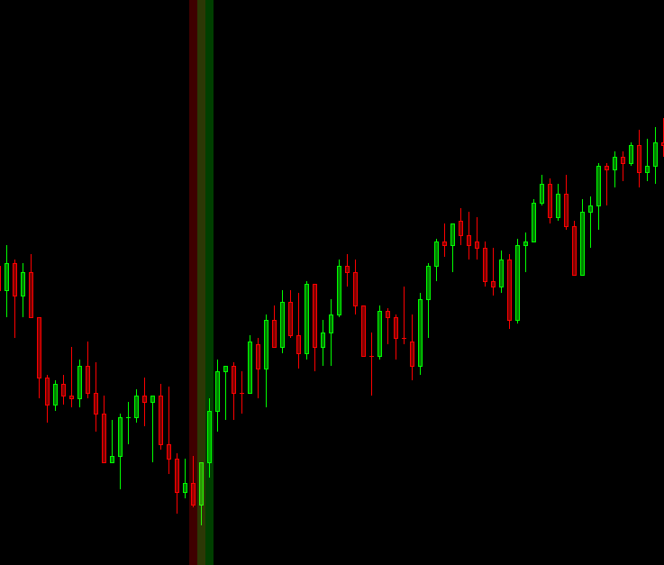
Now, if we go back to five here, next two inputs under this one. Tell the algorithm, what is an extreme reading for both the MACD and the ADX together? So the MACD needs to be lower than negative one and ADX needs to be higher than 40. I know the MACD reading of negative one is not an extreme. But the ADX, you know, the combo with those two does create a more extreme reading and you can change this of course, but you know, these are the settings that I like so that’s what I ship with by default. The next input allows the study to actually go back and paint the failed pinch, which is going to be this blue or purple little bar right here. So if we actually changed this to one. You know what it doesn’t go back and change it, but it goes back because a new pinch opened up right here, but it does go back and paint it, if the previous green release, you know, the previous pinch release was within 10 bars or whatever threshold you want to have right here. So that’s that input.
The next one, there’s a different detection algorithm for whenever the pinch opens and closes, it really matters a lot more for lower timeframe charts. So we’re looking at a 20,000 trade chart. Likely these algorithms won’t make much of a difference, but you can play around with these two different algorithms between normal and advance. I honestly just tell people to just use normal. Advances it’s just slightly different. Sometimes it’ll catch pinches that the normal one wouldn’t catch.
I won’t go into the details ever about how these algorithms are coded because obviously that’s information I’m going to keep to myself. The next three. Inputs are related to the RSI. And I don’t think we’re going to see an RSI background painted on this higher timeframe of this 20,000 trade chart.
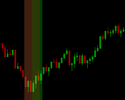
So you’ll likely see them on a smaller timeframe. Let’s go ahead and change the timeframe. Let’s just do 1000 trades and then we’ll come back to this 20,000 trade chart. So let’s see if we can find. One of these, actually I think this one may be it. So yeah, you can see pinching with our side. You’ll see that changed to one.
That means that this background is, the RSI background. The way that it works essentially looks for in our RSI reading of, I believe it’s lower than 12 with an RSI look back of 14, which is just going to be your default RSI. And the idea here is that you can get into this trade. Earlier, so you can get into the street early, before the actual release, and now you have a shorter stop, you know, maybe two, three point stop versus a four point stop. All right. So this is why we added this. In fact, it wasn’t my idea, but somebody else asked me to add this, which, you know, it’s a fantastic idea. If you want to get an early and be more aggressive, it doesn’t always work though, because sometimes price will just continue down. So you need to be aware of that and you need to know that that is the risk that you run.
All right. So let’s go back to this 20,000 trade chart and let’s continue looking through these inputs. All right. We already went over the MACD and ADX. Just make sure that you always point them to the correct subgraphs. So then these next two inputs are super useful. In my opinion, it allows you to have one pinch from a lower timeframe to look at a pinch from a higher timeframe and only paint.
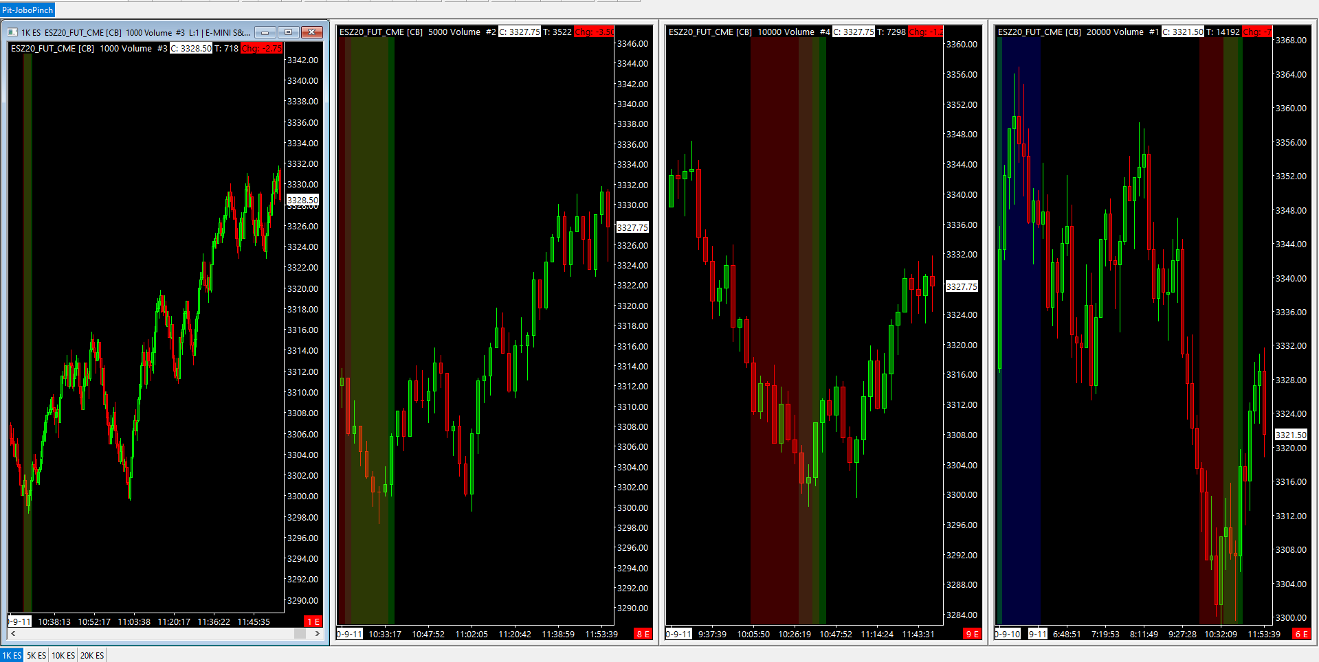
Whenever that higher timeframe is painting. All right, so we can’t do this here on this higher timeframe. So it’s 20,000 trade chart. You could do it if I had another, even higher timeframe, but I like to. Go no higher than 20,000. So we’re going to close this out. I’m going to hide both the MACD and ADX studies in Sierra Chart.
So now we only see the pinch on this chart, and then I’m going to go to this chart over here that I would have open, which is a 5,000 trade chart. Actually, I have it set to 1000, so we’ll switch it over to five. And now we have a 5,000 trade chart and we have our 20,000 trade charts. So what I’m going to do on this 5,000 trade chart is add the MACD and the ADX to Sierra Chart.
So just setting up the pinch here, and then we’ll add the pinch study. The Jobo Pinch pointed to the rites sub graphs. And then what we’ll do here is we’re first gonna just compare them side by side. So yeah, so now we have our 5,000 trade chart right here and our 20,000 trade chart right here. Let’s just make sure there. Yeah. All right. So what they’re synced here and then back to our 5,000 trade chart, we’re gonna point. This pinch from, from this graph right here, which is the shorter timeframe to the pinch over on our higher timeframe.
So we want, we will want to enable this condition and then we want to point it. So pick the 20,000 trade chart, which is going to be our higher timeframe and then pointed to the Jobo Pinch, make sure that this last drop down is just us pinch value, then hit apply, and now you can see. Some of the pinches were removed.
So let’s go ahead and do that again. I’ll move this over just a little bit. And we’re just going to flip this condition from yes to no. So there you go. A few got removed. And the idea here is that you’re going to be taking trades likely off of the shorter timeframe. The larger timeframe gives you a good idea, but with a higher timeframe, you’re getting in at a much worse position, even though the trades will work out more often.
So now if you pair the two, you can get an earlier with the same high probability of, just getting later in with your higher timeframe. So let’s turn this back on. Yes. And let’s see how it looks. So it keeps you out of a few bad trades, right? I think we had a few different releases. I think there was one right here that would have worked out nicely, but I think we had a few other ones through this area where price just kept going down. And, you know, I think this one, unfortunately just wouldn’t have worked out either, but if we look at when the pinch releases on the shorter timeframe, so right here, and please go over here and look at this chart, I’m just lining things up. But if we get long right here, which is way earlier, We have a bigger move to capture on this higher timeframe versus getting in right over here.
Another way to use this is by simply being alert that the shorter timeframe has released and then wait for the higher timeframe to actually release. So it just depends how you want to use it. Again, it doesn’t always work out as you can see, we have some of these blue backgrounds right here and right here.
So you have two failed trades, but you know, your stop, right? So you’re losing 10 points you’re losing, I don’t know, another 10 points at worse through this area. But then you capture 34 points. It’s a game of probabilities, right? So I hope that you found this strategy useful. It’s honestly one of my core trading strategies.
It’s also not a strategy that I came up with. That’s why it’s named the JoboPpinch from one of my buddies Jobo, which you’ll find him on Twitter. So shout out to him and if you have any questions, please shoot him over. So until next time everyone, happy trading!