Below is the transcript of the video you’ll get access to with your subscription.
Hello folks, this is Ralph. And today I’m going to show you how to set up the price TICK divergence study. It is different than the divergent detector study because they’re simply different algorithms. I programmed them differently and the data for the tick, it’s just very different. So I had to program something different right now.
We’re looking at it one minute chart of the e-mini futures, as you can see right here, and we’re going to go ahead and add the tick data to this chart. And so if you click on additional symbol, We’ll just add the TICK data for the New York stock exchange TICK-NYSE.
And you’ll see added in a sub graph down here. I will also added a zero line right here. So this orange line that you see through the data right here, this is at the zero line and it’s just simply so that you can see whenever the TICK is positive or negative. Now let’s go ahead and add our custom study.
So under add custom study, you can select the price tick divergence study. And then if we look at the settings for this study, The first input asks you to feed it, the data for the tick. So since the data is in a sub graph for this chart, you can actually have it in different chart, but you’ll have to select the sub graph if you’re following this tutorial.
And then we just simply use the last value for each candle I’m going to hit apply. And then you’re going to see the different alerts that are added to the chart. And what we’ll talk about them a little bit here, so you can see some alerts drawn here. There’s probably a better day that has a few more alerts.
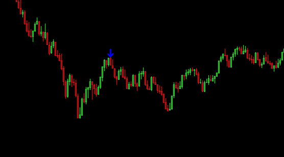
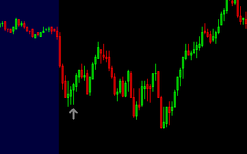
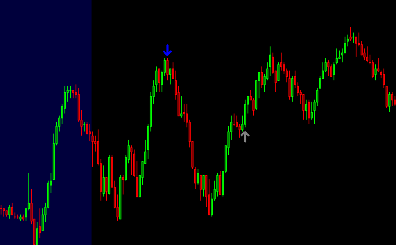
Let’s see if we can find one. Here we go. So this one has an array of different alerts and you can see they’re different colors, right? So there’s gray, blue and green, and there’s a gray one here and a red one here for the short. So there’s actually a total of four colors, but the green and red are in the same category.
So the gray ones are the weakest divergences. So they have the lowest probability of working out. Even though, as you can see, sometimes they do work out, you know, this one’s pointing you to a, and it works out very nicely. If you took that trait, the blue divergences are medium strength divergences, and then the green ones are the strongest divergences.
And then for the short side, you also have the gray, the blue that we don’t have here on the screen. And then we have the red divert says, which are the strongest ones for the shorts. All right. So now let’s go ahead and talk about the different inputs and the best way that I like to explain this is by simply removing all of the conditions and making all of the possible alerts be drawn on this chart.
So I’m going to just change all of these inputs to just show so as much as possible. And then we’ll add the restrictions that you can see how it changes the data. So now you can see all of these alerts mean plotted. Obviously this is completely untradeable, there’s too many alerts. So let’s go back to the inputs of the study.
And the first input allows us to filter some of the data. So a lot of the ticks, especially in this one minute chart for other timeframes, they may close differently. At least for the one minute chart. There’s a high probability that the tick will close near the zero line. And I found that those bars are simply bars that are not worthy to have alerts plotted on them. They can still be considered for divergences for future bars. But just not for that one bar. So I usually filter out closing prices that are between negative 300 and positive 300. So by typing 300 in here and hitting apply, you’ll actually see a lot of these alerts being removed.
The next input asks you, if you want to have a cluster of alerts before even painting an arrow, and we require by default, a cluster of two or more alerts. So if you changed this to, yes, you’ll see that even more alerts get removed from the chart and you can change this number a little bit. The minimum is one.
So you’ve changed this to one. You’ll obviously see more arrows being plotted. If you change it to three, you’ll see less. But two is a happy medium. And I ship with the defaults as I use them for this study. The next input asks you if you want the high or the low of the bar, where the alert would be plotted to have a similar high of a previous high.
So that’s a long way of saying that we want the high for this bar to be near in fact, two ticks away from our previous high, which is, you know, one of these other bars. Cause I believe it’s plotting on the red bar. That is right here. So it’s looking at one of the two green bars next to it. If you can see it.
All right. So we actually want this set to yes. And it’s really just looking for double tops or double bottoms. All right. So you can see, again, a removed a few different plots. And then lastly, this input tells the study to use a different algorithm. And we won’t dive into the algorithm specifics, but just know that if you want more alerts, just set this to more.
But if you want less signals. Just set this to Less, and I prefer it to less because I want to be making less decisions and the trades that I do take, I want to be focused and have them be of high quality. So that really concludes this video. I’ll be making another video teaching you how to use this study in practice.
So please go ahead and watch that next. And until next time everyone, happy trading!